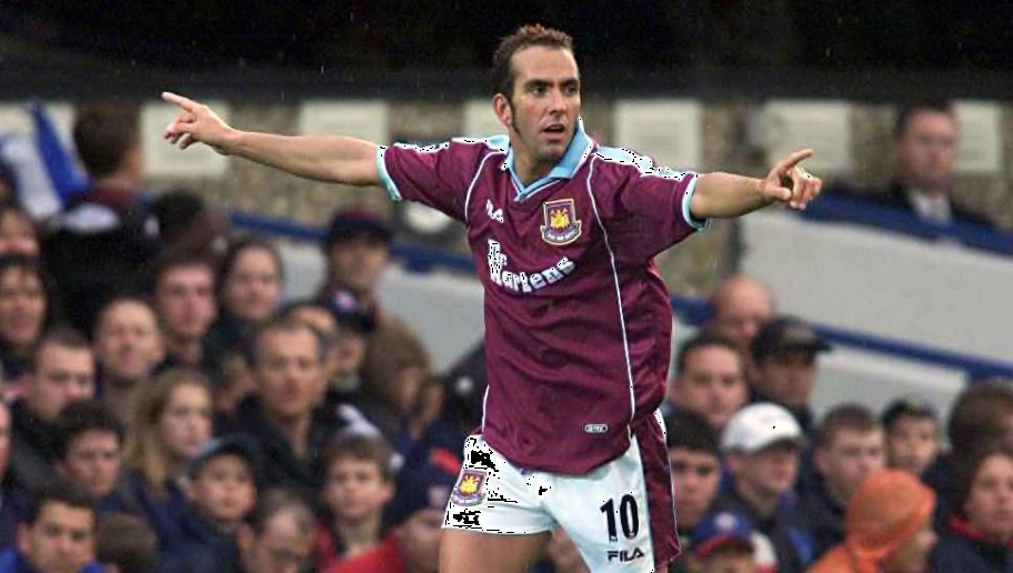
While it feels like West Ham matches should be permanently soundtracked by the Benny Hill theme music, you have to admit that the Hammers are the kings of making almost unrelenting chaos look pretty stylish.
From Paolo di Canio to Dimitri Payet, with West Ham you can at least guarantee that when things do go wrong, at least there's going to have been an incredibly cool goal scored in the process.
West Ham's sartorial choices have been nothing if not a reflection of this beautiful disorder, with flair, class and some truly funky shorts all featuring in some of the most inventive efforts. Here's a look at the top ten threads the Hammers have donned at home...
10. The Original Claret and Blue West Ham Kit (1903-1905)
west ham united team photo 1903-04 season how good is that pic.twitter.com/EyzjaEAitP
— boleyn badges (@boleynbadges) January 13, 2018
West Ham weren't always attired in their iconic claret and blue, starting out life in the Oxford University blue of Thames Ironworks' owner Arnold Hills. Crazy, I know!
Fortunately for fans of killer colour combos, West Ham made the leap to the infamous pairing of light blue and dark red in 1903, possibly (but probably not) after winning a bet against an Aston Villa player, who nicked them some shirts.
It's likelier that they chose to rep the commercial colours of the Ironworks, and they haven't looked back since.
9. Umbro (2015/16)
While some of Umbro's efforts, despite a long-standing association with West Ham, have been curiously understated, there is no denying that their kit commemorating the Hammers' departure from the Boleyn Ground was a decent effort.
What they did to mark the occasion was so simple it almost sounds a bit silly, keeping plain on the shirt front, and changing the colour of the badge and kit sponsor to gold - that'll do the trick lads!
8. Scoreline (1987-1989)
West Ham squad 1988/89 pic.twitter.com/A5fZMbOFON
— When Football Was Better (@FootballInT80s) December 16, 2015
You don't exactly see kids dripping in 'Scoreline' gear nowadays, but given this clean design from the lesser-known manufacturers, perhaps you should!
It's often a little bit difficult to know what to do with the light blue on West Ham's kit, but the Scoreline boys have got the right idea, draping the blue on the outline of the claret to create a snazzy, svelte figure-hugging effect.
7. Bukta (1992-1993)
West Ham United 1992-93 pic.twitter.com/xlSfXZyKCQ
— The League Magazine (@Theleaguemag) November 22, 2015
Similarly, Bukta are as much a thing of the distant past as pogs, ALF and hopscotch, which is a shame because there was a lot going on here.
Sense would have dictated that if you're going to put an elaborate, pub carpet-esque pattern on the claret parts of the shirt, you'd tone down the other two colours which generally feature in West Ham's home kits.
Bukta threw the rulebook out of the window and decided to have the blue and white partying on the shoulders and sleeves of this effort - the 90s, eh?
6. Fila (1999-2001)
Frank Lampard and Paolo Di Canio celebrate for West Ham in 1999. pic.twitter.com/G3Ra89FqhK
— 90s Football (@90sfootball) December 7, 2014
We as a society need to have a frank conversation and admit that West Ham's turn of the millennium Fila kits aren't that nice, they're just popular because of one very good Italian footballer.
I'll walk this extremely unpopular opinion back a bit, the swervy Doc Martens logo such an aesthetically pleasing commercial sponsor, and that dynamic white streak is such a nice touch.
But let's be honest, if it was Felipe Anderson rather than Paolo di Canio wearing the shirt, you'd barely notice this clean but unremarkable effort.
5. adidas (2014/15)
West Ham kits really need to experiment with stripes more often, because it really does look spectacular when it comes off.
They went from the sublime to the ridiculous, back to the sublime then to the ridiculous again in this decidedly horizontal effort from adidas, getting to third at Christmas, slipping to 12th, then qualifying for Europe (which they would eventually be dumped out of by Astra Giurgiu) via Fair Play.
See what I mean by chaos?
4. Pony (1993-1995)
@WestHam @premierleague kits ⚽️
— West Ham Premier (@westhampremier) August 15, 2019
A thread:
1993-1994 & 1994-1995 home kit worn by #MikeMarsh
Sponsored by #DagenhamMotors
Supplied by #Pony#WestHamPremier #WHUFC #Irons ⚒ pic.twitter.com/zyjZNqZO1V
If I was a kit designer, after spending ages on the shirt I would probably just tap out, make the shorts either black or white, and head home.
Thankfully, Pony did not have the same attitude when it came to this sensational mid-90s get-up, refusing to stop at the light blue chevron which acts as the bold centerpiece of the shirt, audaciously complimenting it instead with diagonal claret and blue stripes across the white shorts.
The end result? A kit that looks like something out of the space age, giving the Hammers a dash of va-va-voom.
3. Admiral (1976 European Cup Winners' Cup Final)
European Cup Winners Cup Final at the Heysel Stadium, May 1976. Anderlecht 4 v West Ham United 2. A goal for West Ham past Anderlecht goalkeeper Ruiter pic.twitter.com/RMNfhW9nCE
— boleyn badges (@boleynbadges) April 23, 2019
It's rare that West Ham get a sniff of European glory, and this regal outfit was a once-in-a-lifetime design for an event that has only come round twice for the Hammers - a European final.
Admiral blessed east London with plenty of great designs during the 70s - check out the shorts in 1976-77 - but there's something special about the pride of place the West Ham badge has at the tip of the chevron here.
Shame about the result, but there's no way Anderlecht looked as good for all their 'four goals' and 'winners' medals'.
2. adidas (1983-1985)
West Ham United - Tony Gale - 1984/94 #RSSA #retroshortshortsassociation #WHUFC #westham #adidas pic.twitter.com/SxPYV5fADz
— R.S.S.A (@shortsretro) December 1, 2014
Why has no one else thought to do the light blue as a thick horizontal stripe? It looks very 'we're West Ham and we mean business' and makes up for the blow of their kit being sullied by a sponsor for the first time.
Keen West Ham kit historians will also notice that they've gone all #minimalism with the badge, a thankfully short-lived experiment.
In spite of this oversight, adidas really do know how to make a kit, and they've done it again with this one.
1. adidas (1980-1983)
West Ham v Ajax, Bielefeld Germany 1983 and Ghent Belgium Tournament 1982 how good is that one superb old west ham shirt pic.twitter.com/n4LRg9nZ7F
— boleyn badges (@boleynbadges) August 22, 2019
An adidas shirt? From the early 80s? Yes I've been slightly daring in choosing the shirt from the literal season before the previous one to top the list, but stylistically it's in a league of its own.
This shirt shows that there don't always have to be a million different things going on in the claret and blue jersey to make it a success, leaving the front plain so an uncomplicated but elegant pattern on the sleeves can do the talking.
Source : 90min


